Responsive and Mobile-Ready Web Design
Responsive Web Design (RWD) is an approach to web design in which the layout is make adaptable across a wide range of devices, from desktop computer monitors to mobile phones. You can tell when a Web site is responsive by resizing it in your Web browser window; if it is, you’ll see the telltale “snap” when it adjusts to the different screen sizes it supports.
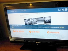
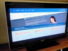
- This is how the Line49 Website looks on a TV
- The height of the home page elements is deliberately set to fit the 16:9 screen
How It Began
Responsive Web Design (RWD) was developed as a solution to a recent problem. After the introduction of the iPhone, browsing the “full Web” using a handheld device became popular, but pinching and zooming was required. As a response, businesses would deploy a separate “mobile site” tailored for the small screen. But after the arrival of the iPad, it became necessary to design for tablets as well, tailoring the content and layout in a slightly different way for a new range of medium-sized screens. Adding yet another separate website was out of the question, so leading Web designers began to change their approach, creating a new generation of all-in-one websites which detect the size and orientation of screen in use, then automatically adapt the content and layout to suit.
RWD is now an industry-standard approach, offered by all professional Web vendors and available even on do-it-yourself Web template sites. However, not all responsive designs are equal. As shown here, we go farther by reviewing and tuning your website’s layout using a minimum of 7 different device class modes:
Device Class |
Example devices |
Mode |
||
| Handheld | iPhones, Androids | Portrait plus Landscape | ||
| Mini Tablet | 7-8″ Android tablets, eg Samsung, Nexus, Kindle | Portrait plus Landscape | ||
| Tablet | iPad, Microsoft Surface, other 10-12″ tablets | Portrait | ||
| Classic Screens | Older CRT monitors, Netbooks, 10″ tablets in horizontal orientation | Landscape | ||
| Widescreens | Laptops, flatscreen monitors, HDTVs | Landscape |
Why we go farther: issues with many ‘responsive’ websites
Here are some examples of what we see in so many websites made today:
- Layout tailored only for full desktop and handheld screens
- Layout looks awkward on in-between device sizes such as mini tablets, which is the fastest-growing category
- Horizontal home page images—intended for landscape screens—appearing tiny on portrait-oriented devices
- Home page content not fitting above the fold on phones in landscape orientation
That’s why we design up to seven layouts for each project, and test thoroughly in each applicable device category. It’s worth the time.


